Ringbearer
© Pete Klassen, 2002. All Rights Reserved.
For ideas, questions or contact: thehutt@gmx.net

Deutsche Version
 
About this font
The Ringbearer font is a replication of the font used in the logo of Peter Jackson's "The Lord Of The Rings" trilogy. I tried to find the original font used in the logo for about half a year, however, without success. So I just tried to re-create it, using different logo types from international sites of LotR.

 
Installation
This font is designed for use with Windows systems. In order to install the font, unzip the ZIP file into a directory on your hard disc, run Control Panel, Fonts, select File->Install New Font, select the directory you've extracted the archive into. After successful installation, the "Ringbearer" font is available for use.
 
Usage
The Ringbearer font is for design purposes only. Using it for normal writing would not do much good. Especially, because of its decorative purpose, the font would not work in applications which do not support font kerning. If you are unsure, if your application is fit for Ringbearer, try to type in "Lord". If the letter "o" is outside of "L", you'll need a better application. I have tested it so far on Adobe Photoshop, Illustrator and Corel Draw, which work fine.


Basically, lower case characters should be used. Upper case characters are much more decorational, and are basically to mark the first or last letter of the word. Therefore, there are sometimes height differences, when upper-case characters are concerned. "R" is for example, smaller than "L": "L" was used in the original "Lord of the Rings" logo to mark the first letter on the logo, and "R" is used in the middle of it. Furthermore, some of the upper-case letters are "hanging", as they are aligned to the top bound of low-case characters, for example, "E" as in German "Herr der RingE":
 

These characters are mostly used for the last letter of the logo.
 
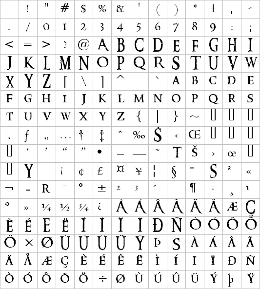
I tried to include all the different characters which were used on different logos of LotR. Therefore, sometimes it was necessary to use multiple characters for each letter. Here is the list of all the letters with comments.


LetterCharacterASCII CodeComment
AA Middle-size A as used in French Anneaux
EE Hanging E; as in German RingE
EÊAlt + 0202Big E, as in German TürmE
FF Hanging F, as similar to E
ii Low-case I with reduced height, as in Rings
iî Low-case I with normal height, as in Zwei
KK Not on any logo; same premise as A and R
OO Middle-size O
QQ Middle-size Q
RR Middle-size R, as in Rings
rr Lower-case R, as in Lord
r®Alt + 169Lower-case R with prolonged tail, as in Herr
SS Large capital S as in Seigneur
SßAlt + 0223Hanging S as in RingS
S©Alt + 0169Large modified S as in TowerS
TT Large capital T as in Two
TAlt + 0153Middle-size T as in Towers
WW Middle-size W

 
About the creation
For creating this font, Flash and bitmap logos from different international sites were used. Especially Flash logos were very helpful, as these were in vector format and contained a lot of details. On occasions, where designs from different countries collided with each other (for example, the capital "A" looks different in "Anneaux" on the French logo and on "Anillos" on the Spanish one), I went for the letter which I simply liked more ;). So, for example, I took the "A" from the French "Le Seigneur des Anneaux" logo. In case none of the logos contained the needed character, the rest of the missing characters as well as the punctuation are derived from Venetian 301 Demi.
 
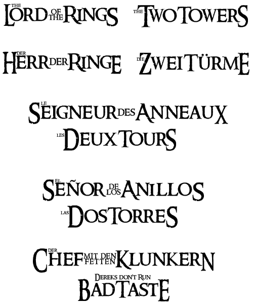
Here an example of the different logos for "Lord of the Rings" re-created solely by using the Ringbearer Font:


Copyright Disclaimer
The Ringbearer font is © Pete Klassen, 2002. All Rights Reserved. You are allowed to distribute this font free of charge only, and only with the complete contents of the original archive file included. You are allowed to use this font for private use only. Commercial use and/or modification of this font are not allowed.
Ringbearer is based on the "Lord of the Rings" Logo. © 2001-2003 New Line Cinema and Wingnut Films. All Rights Reserved.
 
PS: it's just a font from a fan for other fans.